The web strategy for The Landmark Project was a masterclass in building a purpose-driven brand, successfully transforming a simple apparel company into a community hub for outdoor enthusiasts. The strategy was meticulously crafted, combining a powerful messaging platform centered on conservation with an authentic and relatable verbal and visual language. This was all delivered through a user-friendly and accessible online experience that not only showcased products but also fostered a sense of shared values and a deeper connection to nature. The result was a cohesive and compelling brand identity that resonated deeply with its target audience.
Services
Client
Year
Website
Messaging Strategy
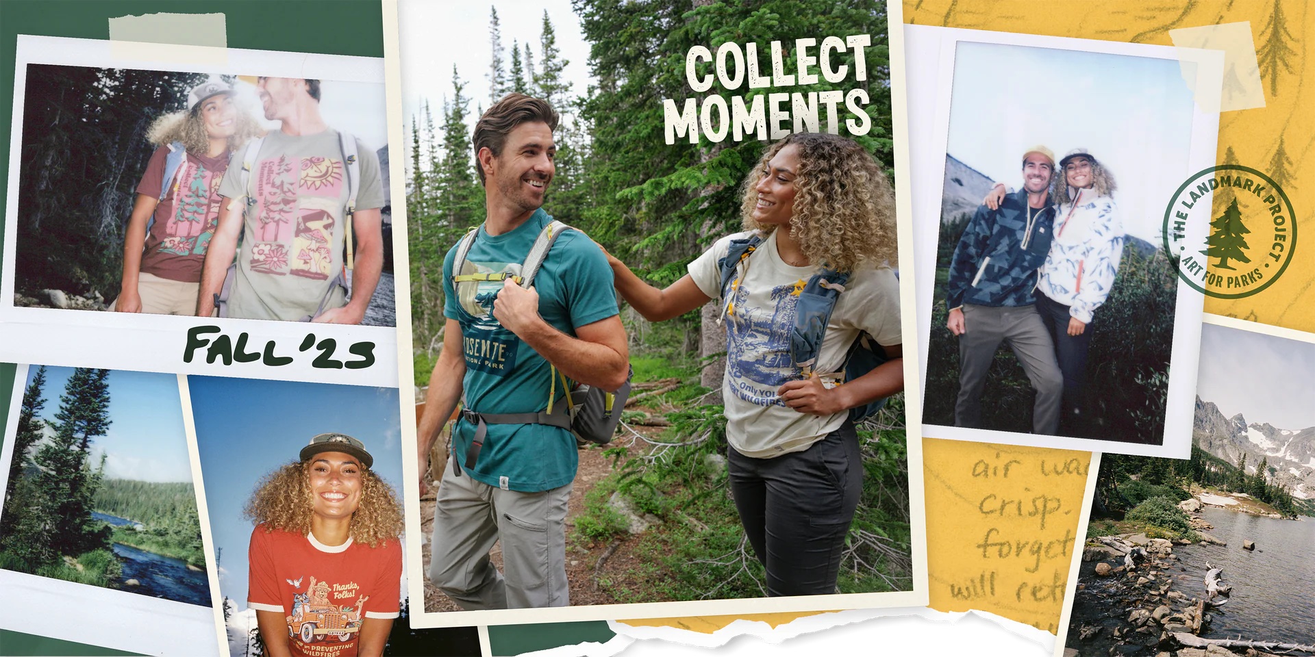
The core of the messaging strategy was to position the company as more than just an apparel brand; it was a community of adventurers dedicated to protecting public lands. This message was consistently communicated through the slogan "Protecting Nature Together" and by highlighting partnerships with conservation organizations.
The website’s messaging made it clear that a portion of every purchase directly supported these conservation efforts, creating a purpose-driven connection with the customer. The brand’s commitment to sustainability was also a key part of the messaging, emphasizing the use of eco-friendly materials and the elimination of unnecessary plastic packaging.
CLIENT TESTIMONIAL
“Before working with House Ink Studio, our organization’s commitment to conservation wasn’t translating effectively online. The team at House Ink helped us articulate our mission into a powerful and cohesive web strategy. They didn’t just build us a website; they helped us craft a clear message that truly resonates with our community and highlights the importance of our work. Thanks to them, our digital presence is now a powerful tool for advancing our conservation goals.“

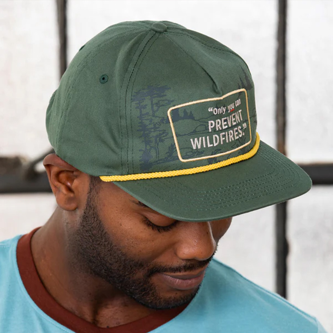
Verbal Language
The verbal language employed was casual, authentic, and evocative of outdoor adventure. Phrases like "gather 'round the campfire!" and "a bunch of adventurers just like you" created a friendly, relatable tone. The copy was designed to tell a story and foster a sense of shared values with the customer. Instead of corporate jargon, the site used simple, direct language to explain its mission and product features, such as "Crafting Sustainable Graphic Tees: A Commitment to Quality and Conservation." This approachable tone was consistent across product descriptions, the "About Us" page, and customer engagement.

Visual Language
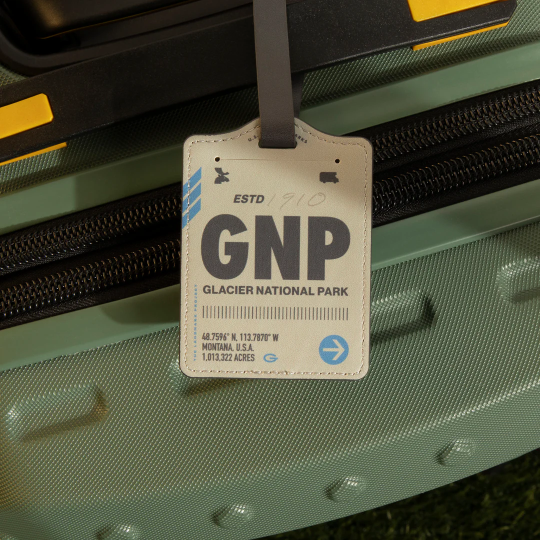
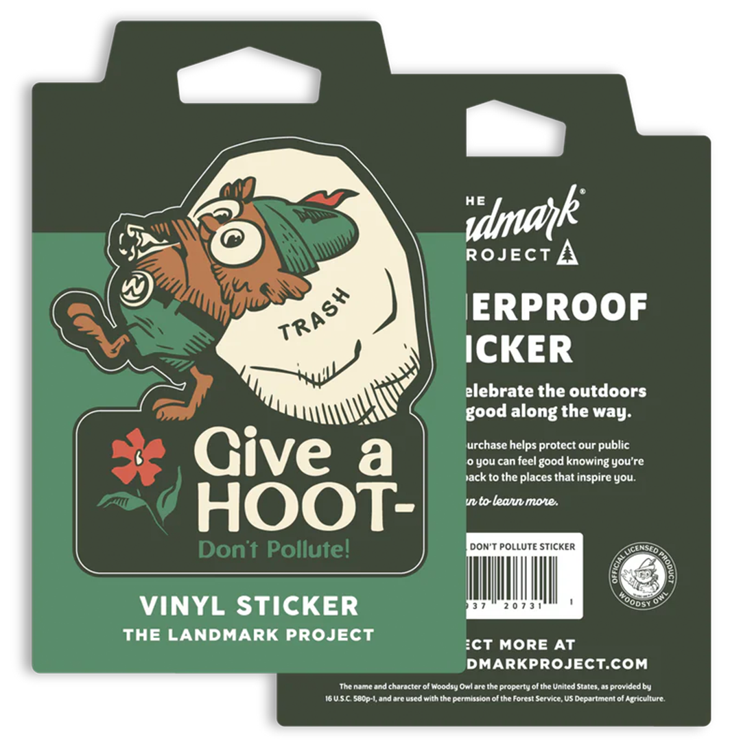
The visual language was a defining element of the brand. It was characterized by original, hand-drawn illustrations of iconic national parks and outdoor destinations.
The designs were artful and long-lasting, serving as a “canvas for original and compelling artwork” that honored the majesty of nature. The color palette was earthy and natural, featuring muted tones like deep navy, smoke grey, and conifer green, which reinforced the brand’s connection to the outdoors. The visual identity was cohesive across all products, from t-shirts and hats to posters and stickers, creating strong brand recognition.