Why Your Brand Visual Identity is Your Most Powerful Asset
If you’re an experienced founder or marketer, you already know that a successful brand isn’t built on luck—it’s built on precision. Yet, many still overlook the sheer strategic power of their brand visual identity. It’s the silent communicator, the split-second decision-maker for your customer. Getting your visual identity right is no longer optional; it is fundamental to achieving market penetration and sustaining longevity.
We’re diving deep into the architecture of world-class aesthetics. We’ll show you how to move past generic design and truly engineer a brand aesthetic that resonates deeply with your target audience. We’ll break down the essential components—from typography for branding to intentional brand photography—and give you the blueprint for visual identity design that transcends a simple logo and builds a memorable “vibe.”
Stop leaving first impressions to chance. This guide will arm you with the actionable framework needed for modern brand design, implementation, and governance of a powerful brand visual identity that converts casual browsers into dedicated advocates.
Visual Identity: More Than Just a Logo
Let’s be clear: Your visual identity is more than just a logo. A logo is a mark; the identity is the entire language system that supports it across every single touchpoint. A holistic brand design system dictates everything from the texture of your website background to the light quality in your social media content. It’s the cohesive, recognizable system that your audience uses to identify you instantly.
Think of it as the complete visual narrative of your brand story. This narrative must be consistent, scalable, and, above all, emotionally resonant. When a customer encounters your brand, whether through an ad, an email, or an in-store display, the experience must feel unified. If the brand aesthetic is disjointed, your brand’s core message—and its credibility—crumbles.
Defining the Core Brand Vibe
Before you select a single color or font, you must define the “vibe.” This isn’t a nebulous feeling; it’s a strategic definition rooted in your brand architecture. Experienced marketers understand that the visual identity must be a direct translation of the brand’s mission, values, and personality.
Ask yourself these critical questions:
Personality: Is your brand minimalist, playful, serious, luxurious, or accessible?
Promise: What is the core emotional benefit your brand delivers? Trust, freedom, excitement?
Target Persona: What visual cues already appeal to your ideal customer? Where do they spend their time online?
By answering these questions, you create the bedrock for your brand design and visual identity design. You are setting the rules for the aesthetic game, ensuring every subsequent design decision—be it selecting a typeface or directing brand photography—serves a defined purpose.
The Unforgettable Pillars of Brand Aesthetics
To successfully create a brand aesthetic that resonates, you must master the core visual pillars. These elements work in concert, amplifying your brand’s personality and ensuring instant recognition. When these pillars are robust and aligned, your visual identity design becomes powerful and magnetic.
Strategic Color: Painting Your Brand’s Emotion
Color is the single most immediate psychological trigger in your brand’s visual identity. A meticulously selected brand color palette can convey energy, trust, or sophistication before a single word is read. This is psychographic design in action.
Your brand color palette should include:
Primary Colors: Your main brand hues, often used for the logo and key calls-to-action (CTAs).
Secondary Colors: Hues used for data visualization, backgrounds, or complementary graphics.
Accent Colors: High-contrast colors reserved for warnings, highlights, or urgent action buttons.
Neutrals: The workhorse colors (blacks, grays, whites) that provide necessary white space and legibility.
When choosing, consider the cultural and psychological meanings of your colors. A finance tech company might lean on blues (trust, stability), while an organic food brand would gravitate toward greens and earth tones (nature, health).
Typography for Branding: Speaking in Style
The saying goes, “If color is the emotion, typography is the voice.” Choosing the right fonts—or type families—is one of the most technical and vital components of visual identity design. Effective typography for branding establishes tone, aids legibility, and creates a clear hierarchy of information.
When selecting your type stack, focus on:
Primary Typeface (Headline/Display): This is your brand’s personality carrier. It should be unique, distinct, and highly legible at large sizes.
Secondary Typeface (Body/UI): This must be highly readable for long-form content. Look for generous x-heights and clear weight differentiations. Often, a clean, modern sans-serif or a carefully chosen serif works best.
Licensing & Scalability: Ensure your chosen fonts are licensed for web, print, and all necessary applications. This prevents costly surprises as you scale.
“A brand’s typeface is its non-verbal promise. It tells the reader how to feel about the information they are consuming. Choose a family that is flexible enough to handle the complexity of your messaging.”
Icons and Graphic Elements
These are the smallest, but perhaps most functional, assets in your visual identity design system. Icons, patterns, and custom illustrations (or “spot graphics”) reinforce your brand when photos or extensive text aren’t appropriate. They maintain the consistency of your overall brand aesthetic that resonates. Ensure your icon set is designed to match the weight and style of your primary typography.
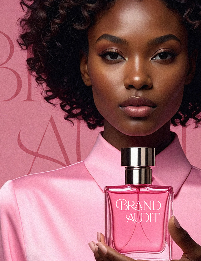
Brand Photography and Imagery: Showing, Not Telling
In a visually saturated market, intentional brand photography is your secret weapon against bland stock imagery. It is a critical component for translating your brand’s emotional promise into a tangible reality. The quality, composition, and emotional tone of your visuals communicate your commitment to excellence in brand design.
The Power of Intentional Visuals
Your imagery strategy must go beyond simply showing your product. It must convey the aspirational lifestyle, the problem solved, and the feeling achieved by your customer.
Key considerations for impactful brand photography:
Lighting and Mood: Are your images bright and airy (optimism), or dark and high-contrast (drama, luxury)? The lighting defines the feeling.
Color Grading: Use post-production effects and filters to subtly reinforce your brand color palette. This ensures consistency even if different photographers are involved.
Composition and Subject Matter: If your brand values human connection, feature people interacting with your product. If it values precision, use clean, detailed close-ups.
This level of detail moves your imagery from mere decoration to a powerful brand design tool.
Using Photography and Imagery to Establish Trust
In the B2B space, brand photography can be highly effective in conveying authority. Use authentic, high-quality images of your team, your office environment, and your processes. These visuals act as credibility signals, reassuring potential clients that your brand is transparent and trustworthy—a foundational element of a strong brand aesthetic that resonates.
Creating a Brand Mood Board: The Visual Blueprint
You’ve defined your strategy and selected your core elements. Now, how do you synthesize them into a single, cohesive vision? You need a brand mood board. Creating a brand mood board is the essential, often-skipped step that bridges the strategic brief with the final visual identity design. It is a tactile, dynamic collage that captures the desired “vibe.”
A brand mood board is not a random collection of pretty pictures. It is a curated tool that allows stakeholders to see, feel, and agree upon the aesthetic direction before costly brand design work begins. It eliminates subjective feedback later in the process (“I just don’t like the feel of it”) by establishing a shared visual vocabulary upfront.
Step-by-Step Mood Board Tutorial
To effectively create your ultimate brand mood board, follow these steps:
Gather Inspiration (The Raw Data): Collect images, textures, typography samples, color swatches, packaging mockups, and even snippets of writing that evoke your brand’s defined personality.
Tip: Include images that represent your aspirational customer lifestyle, not just your product.
Curate and Cull (The Edit): Narrow the collection down to the absolute essentials. If a visual doesn’t strongly communicate one of your core brand attributes, remove it. Be ruthless. You should aim for focused clarity, not visual clutter.
Synthesize the Pillars: Arrange your chosen items to clearly show the relationship between them. Place your proposed typography for branding next to a brand photography example that demonstrates the intended mood. Put the primary brand color palette adjacent to the overall mood of the board.
Test the Vibe: Present the brand mood board to internal teams and trusted external advisors. Does it immediately and accurately convey the brand’s core personality? This is the final test for your desired brand aesthetic that resonates.
(Internal Link Suggestion: Link to a detailed guide on Brand Archetypes)
Launching Your Visual Identity Design Guide
A world-class brand visual identity is useless if it can’t be consistently applied by everyone, from a junior designer to a new marketing intern. This is where your official Brand Guidelines (often called a “Style Guide” or “Design System”) come into play.
Your final guide should be the single source of truth for all brand design and visual identity design decisions.
Essential components of your guide include:
Logo Usage: Specifications for size, clear space, primary/secondary versions, and usage on different backgrounds.
Brand Color Palette Codes: Exact hex, RGB, and CMYK values for all primary, secondary, and accent colors.
Typography Hierarchy: Clear rules on which typeface to use for H1, H2, body copy, captions, and CTAs.
Brand Photography Mandates: Rules defining subject matter, composition, acceptable filter levels, and lighting styles (this is how you scale the integrity of your photography efforts).
Tone of Voice: Guidance on the accompanying verbal identity, ensuring that what you say aligns perfectly with what you show.
By formalizing these rules, you protect the investment you made in your brand’s visual identity and ensure that every customer interaction strengthens the overall brand impression. This is how you govern consistency, which is the cornerstone of trust in brand design.
(External Link Suggestion: Link to Nielsen Norman Group on Visual Consistency)
Conclusion: Engineering Unforgettable Brand Resonance
You now possess the framework for moving beyond surface-level branding to strategic visual identity design. Remember, building a truly unforgettable brand aesthetic isn’t about chasing trends; it’s about aligning every choice—from the weight of your typography for branding to the composition of your brand photography—with your core promise.
The goal is to achieve total cohesion, so that your brand aesthetic that resonates feels not just designed, but inevitable. By meticulously defining your core “vibe” and using tools like a brand mood board, you eliminate inconsistency and start converting visual recognition into market authority. Take this guide, audit your current brand design assets, and commit to the disciplined execution of your brand visual identity.
Ready to transform your disjointed assets into a unified, market-leading brand? Contact our brand design strategy team today to schedule your comprehensive visual identity design audit and consultation.
FAQ: Frequently Asked Questions About Visual Identity
A full overhaul of your brand visual identity should only happen when your core brand strategy, mission, or target audience fundamentally shifts. However, a “refresh”—updating your typography stack, modernizing your secondary brand color palette, or refining your brand photography style—should be considered every 3-5 years to maintain a relevant brand aesthetic that resonates and ensure you avoid visual stagnation in a fast-moving market.
The most common mistake with typography for branding is choosing too many type families or selecting fonts that are illegible at small sizes. Over-complicating the system dilutes the visual identity design and hampers readability. Stick to a maximum of two strong type families that are easy to distinguish and have a wide variety of weights and styles to ensure maximum flexibility across all digital and print touchpoints.
Yes, creating a brand mood board is essential. A brief is textual; a mood board is visual. The board validates the textual strategy by translating abstract words like “approachable” or “luxurious” into concrete visual references (e.g., specific textures, light qualities, and brand color palette combinations). It is the final check before investing heavily in the full visual identity design and subsequent brand photography direction.
Before you select a single color or font, you must define the "vibe." This isn't a nebulous feeling; it's a strategic definition rooted in your brand architecture.