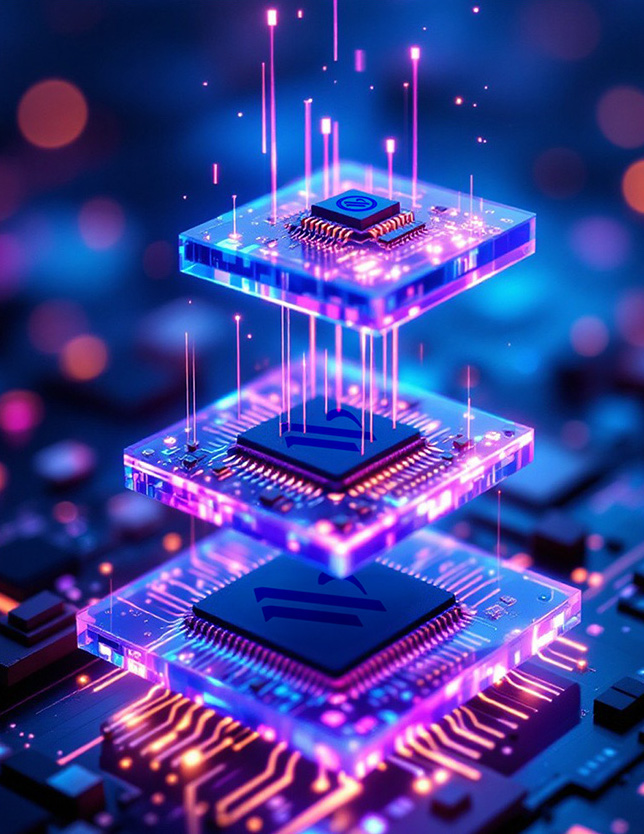
The digital landscape in 2025 is a vibrant canvas where innovation, user experience, and aesthetic brilliance converge. The era of static web pages has long receded, giving way to dynamic, interactive, and deeply immersive online environments.
The websites setting the benchmark for design excellence in the coming year are not merely visually appealing; they are meticulously crafted digital experiences that anticipate user needs, tell compelling stories, and leverage cutting-edge technologies to redefine online interaction. This report delves into the defining characteristics of these leading sites, showcasing how they blend artistic vision with technical prowess to achieve unparalleled digital presence.
The Evolving Tapestry of Web Design in 2025
Web design in 2025 is characterized by a profound shift towards dynamism and interactivity. Brands are increasingly utilizing their online platforms to create memorable impressions through sophisticated animation, bold color choices, and even integrated short films. This evolution moves beyond simple aesthetics, aiming to forge deeper connections with visitors through engaging and responsive interfaces.
Several prominent trends are shaping this transformative period in web design:
- Animation Stimulation: Movement and animation are pervasive across the web, allowing brands to differentiate themselves with dynamic elements that reflect their identity and personality. This includes everything from subtle micro-interactions to elaborate short films that captivate the audience.
- Layered and Geometric Aesthetics: Designs are embracing scrapbook layering and a strong geometric aesthetic, adding depth and visual intrigue to layouts.
- Mini-sites and Visible Grids: The emergence of focused mini-sites and the intentional display of underlying grids contribute to structured yet creative presentations.
- Moving Type and Dopamine Color Palettes: Typography itself becomes dynamic, with moving text adding a lively dimension. Color palettes are increasingly bold and vibrant, designed to evoke positive emotional responses.
- Retro Resurrection and Brutalism: A nostalgic nod to retro styles coexists with bare-bones brutalism, demonstrating a diverse range of aesthetic expressions.
- Custom Illustrations and Organic Shapes: Unique custom illustrations are a defining trend, alongside the use of organic shapes that create more fluid and inviting atmospheres, moving beyond traditional grid-based layouts.
- Dynamic Cursors and Parallax Scrolling: Interactive elements like dynamic cursors, which change appearance based on user interaction, and parallax scrolling, which creates an illusion of depth, are becoming more popular for enhancing engagement.
- Dark Mode and Full-Page Headers: Dark mode is no longer just an option but an expected feature, offering reduced eye strain and energy savings on certain screens. Full-page headers, or “hero sections,” dominate the initial visual impact, setting the tone with stunning visuals and compelling calls-to-action.
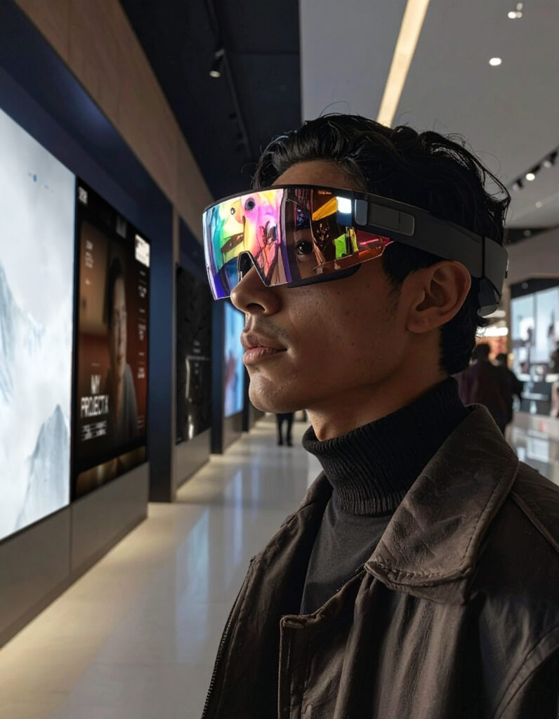
Beyond visual trends, technological advancements are fundamentally reshaping user experience (UX) and user interface (UI) design. The integration of advanced analytics and Artificial Intelligence (AI) is revolutionizing decision-making, enabling personalized digital experiences and optimized engagement. Augmented Reality (AR) and Virtual Reality (VR) are blurring the lines between physical and digital worlds, expanding beyond gaming into diverse sectors like healthcare and e-commerce, offering deeply immersive applications. Voice-Driven User Interfaces (VUI) are redefining hands-free control, improving accessibility and convenience. Furthermore, emotionally intelligent design, which leverages sentiment analysis and behavioral data, is becoming central to creating more human and intuitive digital interactions. These technological integrations are not merely features; they represent a fundamental shift in how users connect with digital platforms, moving towards experiences that are more adaptive, predictive, and engaging.
Criteria for Top-Tier Web Design
The selection of the best-designed websites of 2025 is based on a comprehensive evaluation of both aesthetic appeal and functional excellence. A truly top-tier website seamlessly integrates cutting-edge trends with timeless design principles, prioritizing the user at every touchpoint.
Key criteria that define exceptional web design include:
- Simplicity and Visual Hierarchy: A clean, minimal design is paramount for a positive user experience, avoiding clutter and focusing on essential elements. A clear visual hierarchy guides users’ eyes, making content digestible and intuitive.
- Navigability and Consistency: Navigation must be intuitive, allowing visitors to find information effortlessly. Consistency in design elements, from color palettes to typography, ensures a cohesive and predictable user journey.
- Responsiveness and Accessibility: Websites must adapt flawlessly to all screen sizes, from smartphones to large monitors, ensuring a seamless experience across devices. Accessibility is no longer optional; it is a necessity, catering to diverse user needs, including those with disabilities, by adhering to guidelines like WCAG.
- Functionality and Performance: A well-designed site is optimized for performance, loading quickly and functioning smoothly across all devices. This includes optimizing images, animations, and videos to prevent slow load times and writing clean, efficient code.
- User Experience (UX) Focus: Good web design considers both user and business needs, aiming to provide an intuitive and seamless experience. The initial impression of a website is critical, and design plays a key role in captivating the audience from the outset. This emphasis on user experience is not just a design preference; it is a direct contributor to search engine optimization (SEO). Websites that prioritize a seamless user experience across devices gain a competitive edge in search rankings, as search engines like Google explicitly favor mobile-friendly and user-centric designs. This establishes a clear relationship: superior user experience, driven by thoughtful design, directly leads to improved search engine visibility and higher rankings.
- Creativity and Innovation: The best sites push boundaries, incorporating new development and design ideas, whether through immersive 3D, interactive elements, or unique storytelling approaches.
- Content Organization: Balancing content density with sufficient white space and accommodating dynamic content without compromising layout are crucial for readability and engagement.
- Ethical and Sustainable Design: A growing emphasis is placed on designing for long-term user well-being, reducing manipulative interfaces, and encouraging mindful consumption of digital content.
These principles, combined with a commitment to pushing creative boundaries, define the top-tier websites of 2025.
The Top 25 Best-Designed Websites of 2025
The following websites represent the pinnacle of digital design, each showcasing unique features and innovations that set them apart.
1. Montfort: Immersive 3D Financial Storytelling
Montfort sets a new standard for corporate web design. It excels in transforming complex financial concepts into a visually engaging and intuitive experience, particularly for a commodity trading and asset investment company. The site heavily utilizes 3D elements in its pages and transitions, creating an immersive and dynamic user journey that moves beyond traditional flat web design.
A minimalist color palette of HEX #29648e and HEX #f4f6f8 ensures a clean, modern aesthetic, allowing its interactive 3D graphics to truly shine. The incorporation of gestures and interactive UI design further enhances user engagement. This innovative approach to professional business presentation makes it a leading example of how sophisticated design can elevate corporate communication.
- Link: https://mont-fort.com/
2. Anime.js: Lightweight Animation Mastery
Anime.js exemplifies how a technical product can be showcased with artistic flair. Its dynamic header animation, a prominent visual element from its hero image, immediately captivates visitors. The site’s design is lightweight and modular, contributing to efficient animation performance, which is effectively demonstrated through its features presented within a gallery.
The innovative “scroll scrubber” pagination and a clear “Start Animating” call to action highlight its user-centric approach, making complex animation capabilities accessible and engaging. This combination of engaging animations, efficient design, and clear demonstration of capabilities positions Anime.js as a prime example of top-tier web design.
- Link: https://animejs.com/
3. Navigate: Gamified Web3 Data Visualization
Navigate pioneers a “gamified and decentralized data collection” platform, marking a significant innovation in Web3 design. Its unique character animations, custom icons, and “pause loops” create a highly interactive and engaging user experience, transforming data collection into an enjoyable activity. The site’s storytelling approach and data visualization capabilities are presented within a concise two-color palette (HEX #FF6D38 and HEX #8584FF), demonstrating how complex Web3 concepts can be presented in an accessible and visually captivating manner.
Its strong responsive design ensures a consistent user experience across various devices. Navigate stands out for its ability to blend advanced functionality with compelling visual and interactive elements, making it a leader in the Web3 space.
- Link: https://nvg8.io/
4. Siena Film Foundation: Cinematic Narrative & Dynamic Navigation
Siena Film Foundation excels in cinematic storytelling through its web design. Innovations like the “Film Strip Slider” integrated into the navigation provide an engaging and thematic way to browse content, mimicking the visual of a traditional film strip. The “Procedural Slider Re-Arrangement” offers a dynamic and fresh user experience with each visit, while a captivating brand intro animation sets the tone from the moment the site loads.
Its minimalist black and off-white color palette (HEX #000000 and HEX #FAF7EF) allows the rich content and dynamic elements to command attention. This combination of a clean aesthetic, dynamic interactive elements, and strong performance across design metrics makes the Siena Film Foundation website a notable example of top-tier web design.
- Link: https://www.siena.film/
5. Dropbox Brand: Interactive Typography & Motion Design
The Dropbox Brand website redefines brand experience through interactive play and artful detail. Its core innovation lies in engaging users through elements like the “Iconography Slot Machine,” “Typography Widgets,” and “Color System Showcase,” which react to user mouse movements, encouraging visitors to “linger a little longer, to look a little closer”. The “Logo Design Breakdown” and “Motion Timeline” elements, activated by scrolling, provide an interactive journey through the brand’s visual identity and evolution.
The innovative use of “Motion Easing Demo” and “Typography Cursors” showcases meticulous attention to motion design. Its concise two-color palette (HEX #0061FE and HEX #1A1918) contributes to a clean and cohesive visual identity. The Dropbox Brand website stands as a masterclass in interactive branding, demonstrating how a brand’s essence can be conveyed through dynamic and engaging digital experiences.
- Link: https://www.dropbox.com/
6. Immersive Garden Website: Portfolio with Bas-relief & Rapid Scroll
The Immersive Garden website itself serves as a powerful testament to its agency’s “decade of innovation and digital craftsmanship”. It showcases a distinct “Projects Listing” and incorporates a unique “Bas-relief” interactive element, adding a sense of depth and sculpted appearance that enhances user engagement.
The site features a dynamic “Menu Transition,” presented as a video element, ensuring a smooth and visually appealing navigation experience. A “Rapid Scroll feature” provides an efficient and visually interesting way for users to quickly navigate through content. The minimalist black and light grey palette (HEX #000000 and HEX #c2c2c2) allows its experimental, 3D, and animation-heavy projects to take center stage. This website is a prime example of how an agency can leverage its own platform to demonstrate its advanced capabilities in web and interactive design.
7. Cartapani: Elegant E-commerce with Responsive Design
Cartapani showcases a blend of quality and innovation in its e-commerce design. Its recognition as a top-tier “Shopping” platform implies a highly functional, user-friendly, and visually appealing interface optimized for conversions. Its responsive design ensures a seamless experience across various devices, which is a critical factor for modern e-commerce success, allowing users to browse and purchase effortlessly regardless of their screen size.
The site’s design effectively supports its business objectives, likely through intuitive product presentation, streamlined checkout processes, and an overall polished aesthetic that instills trust and encourages engagement. The site’s ability to maintain its unique organoleptic properties through 4.0 technology suggests a harmonious integration of advanced technology with user-centric design.
- Link: https://cartapani.it/en/
8. SPYLT Milk: Catchy & Captivating E-commerce
SPYLT Milk features a “catchy and captivating ecommerce website” designed for a “bright and energetic brand of protein-rich caffeinated chocolate milk”. Its visual appeal and engaging nature are key to its success.
The site’s responsive design ensures it looks and performs well on any device, which is essential for an e-commerce platform aiming to reach a broad audience. The design likely employs elements that make the product visually appealing and the shopping experience enjoyable, demonstrating how a strong brand identity can be translated into a compelling digital presence that resonates with its target demographic.
- Link: https://www.spylt.com/
9. Kalm Moments: Serene Spa & Wellness Haven
Kalm Moments creates a “serene spa and wellness haven” online. The website’s design likely uses calming aesthetics, such as soft color palettes and natural imagery, combined with intuitive navigation to offer a tranquil user experience. Categorized under “Lifestyle” and “Responsive,” it demonstrates how design can evoke emotion and brand atmosphere effectively, providing a relaxing digital escape for users seeking rejuvenating treatments for body, face, and hair.
The site’s success lies in its ability to translate a physical, sensory experience into a digital one, making users feel at ease and inviting them to explore the services offered. This highlights the power of web design in creating an immersive brand environment that aligns perfectly with the service provided, fostering a sense of peace and well-being even before a visit.
10. Gufram: Radical Design Meets Italian Craftsmanship
Gufram’s website embodies a “bold, avant-garde spirit” that perfectly reflects its brand identity. The site effectively showcases iconic furniture pieces, redefining the boundaries between art and design in a digital space. Its design implies a visually rich experience that highlights product detail and craftsmanship, likely through high-quality imagery, sophisticated layouts, and responsive design.
The design is categorized under “Lifestyle,” “Responsive,” “Black,” and “White,” suggesting a focus on timeless elegance and strong visual contrast to emphasize the unique forms of Gufram’s furniture. This website demonstrates how digital platforms can serve as powerful extensions of a brand’s artistic philosophy, appealing to an audience that appreciates radical design and Italian craftsmanship.
- Link: https://gufram.it/en/
11. Iceberg: Transmedia Storytelling for Climate Action
Iceberg stands out as a transmedia project and documentary series dedicated to revealing “hidden solutions to the climate crisis”. Its design effectively communicates complex global issues through compelling stories, integrated podcasts, and initiatives. This suggests a powerful use of visual narrative, seamless multimedia integration, and intuitive content organization to engage users on a critical global issue.
The site’s ability to blend educational content with engaging storytelling elements underscores design’s crucial role in impactful communication and advocacy. It serves as a model for how digital platforms can be leveraged to inform, inspire, and mobilize audiences around significant social and environmental causes, making complex information accessible and actionable.
12. U x Machina: Creative-Tech Studio with Easter Eggs
U x Machina exemplifies a “creative-tech studio that crafts bespoke digital solutions, elevating how people engage with machines”. Its engaging loading and introductory animations immediately set a dynamic tone. The unique landing page scroll and a scrolling founders section create a dynamic journey, presenting information in an innovative and interactive manner.
The inclusion of an interactive 404 page demonstrates meticulous attention to detail and a commitment to user experience even in error states. Furthermore, an “Easter egg” activated by a press and hold action adds a playful, hidden feature that encourages user discovery and deeper engagement. U x Machina showcases how a creative agency can use its own website to demonstrate its advanced capabilities and commitment to innovative digital solutions.
- Link: https://uxmachina.co/
13. 8bit AI: Immersive 3D Manifesto & Text Animation
8bit AI presents its mission of making “next-gen AI and accelerated computing accessible to everyone” through an “immersive 3D manifesto”. Key features include a dynamic particle system, engaging text animations, advanced WebGL transitions, and sophisticated camera movements, all contributing to a visually rich and interactive experience.
Its minimalist black and white color palette (HEX #FFFFFF and HEX #000000) amplifies the impact of these interactive elements, allowing the dynamic content to stand out. 8bit AI demonstrates how complex technological concepts can be presented through a captivating and creative digital journey.
- Link: https://www.8bit.ai/
14. The ADHD Experience: Experimental Symptom Visualization
The ADHD experience is a groundbreaking experimental website that visualizes ADHD symptoms through interactive design. It uniquely reflects the symptoms and everyday impact of ADHD through an interactive header and footer, and experimental introductory explanations. The site visually represents ADHD symptoms such as hyperactivity, disorganization, and impulsivity, likely through interactive elements that allow users to experience or understand these symptoms more directly.
The bold color palette (HEX #2B2BFF and HEX #FF4000) and the use of parallax scrolling and 3D elements contribute to its high creativity. This innovative approach makes a complex topic tangible and engaging, fostering empathy and understanding. The ADHD Experience stands as a powerful example of how web design can be used for social impact and educational purposes, transforming abstract concepts into immersive, relatable digital journeys.
15. Bright Biotech: Vibrant, Scroll-Driven Scientific Storytelling
Bright Biotech excels at transforming complex scientific information into a “vibrant, fast, and engaging digital story”. Its homepage navigation and story transitions guide users smoothly through its narrative. Interactive scrolling stories are featured across key pages like “Tech,” “Mission,” and “Team,” allowing users to actively engage with the content as they scroll, revealing information in a dynamic and captivating way.
The site incorporates animated icons for core values and spinning 3D product icons, adding a modern and dynamic visual flair. The distinct color palette (HEX #034739 and HEX #bbfd6a) demonstrates its innovative approach to scientific communication. Bright Biotech exemplifies how compelling design can make intricate scientific concepts accessible and exciting, fostering greater understanding and engagement.
16. Buttermax: Buttery Smooth Digital Production
The Buttermax website is celebrated for its “buttery smooth digital production”. Its design is characterized by “colorful,” “liquid,” and “WebGL” elements, showcasing advanced graphical rendering and fluid animations that create a highly immersive experience.
Buttermax sets the standard for outstanding visual aesthetics, seamless user experience, and cutting-edge design ideas. Its consistent high scores across User Interface (UI), User Experience (UX), and Innovation indicate its excellence in visual appeal, functionality, and the integration of novel design and development concepts. Buttermax’s commitment to pushing the boundaries of interactive web design makes it a true trailblazer in the digital space.
- Link: https://buttermax.net/
17. Cartier Watches and Wonders 2024: Immersive Timepiece Exploration
This Cartier site offers an immersive experience where users explore timepieces by scrolling through “different universes crafted for Watches and Wonders”. Its animated and responsive design, coupled with WebGL technology, allows for sophisticated 3D representations of watches, bringing the products to life in a captivating manner.
High UI and Innovation scores highlight its exceptional visual appeal, intuitive functionality, and groundbreaking use of interactive elements to elevate product presentation. The site’s ability to create a luxurious and engaging digital environment for high-end products demonstrates a masterful blend of design artistry and advanced web development, setting a benchmark for e-commerce and brand storytelling.
18. Active Theory V6: Cutting-Edge AI Chat & Multiplayer
Active Theory V6 pushes the boundaries of web interactivity. It features new rendering techniques, an integrated AI chat, and even multiplayer functionality, creating an exceptionally engaging and personalized user experience. Its “colorful,” “liquid,” and “WebGL” tags denote a visually rich and dynamic interface with fluid animations and advanced 3D graphics rendered directly in the browser.
The successful implementation of cutting-edge features like AI chat and multiplayer capabilities, combined with stunning visuals, positions this site as a leading example of modern web design and a glimpse into the future of interactive platforms.
19. Contra | Project Cost Calculator: Animated & Functional Tool
Contra | Project Cost Calculator demonstrates how functional tools can be beautifully designed and highly engaging. Its “animated” and “WebGL” tags indicate dynamic visual elements and advanced graphical rendering, making a practical application like project cost calculation highly interactive and intuitive.
The site excels in aesthetics, intuitive functionality, and novel design ideas. It streamlines project hiring and budgeting with a seamless user experience, proving that even utilitarian websites can be transformed into captivating digital products through thoughtful design and advanced technology. This site sets a high standard for combining utility with visual appeal.
20. Noomo Labs: Immersive 3D & AR Activations Showcase
Noomo Labs is a compelling showcase for “cutting-edge immersive experiences, 3D websites, AR activations, and interactive web experiences”. Its “animated,” “scroll,” and “typographic” tags highlight dynamic visuals, innovative scrolling mechanics, and creative use of text that contribute to its immersive quality.
Noomo Labs epitomizes how an agency can present its advanced capabilities through its own groundbreaking website. The site serves as a live demonstration of its expertise in creating next-generation digital platforms, blending sophisticated technology with user-friendly design to offer a truly interactive and memorable experience.
21. Longines Spirit Flyback: Narrative-Driven Product Exploration
The Longines Spirit Flyback site offers an interactive, narrative-driven journey into aviator Richard Byrd’s history. Its responsive design, scroll-based interactions, and WebGL integration create an immersive and visually rich experience for a product showcase, allowing users to delve into the story behind the timepiece.
Its polished aesthetics, seamless navigation, and cutting-edge approach to blending historical storytelling with product presentation are highly regarded. The site’s ability to intertwine a rich narrative with detailed product display demonstrates a sophisticated understanding of user engagement, making it a standout example of how luxury brands can leverage digital platforms for compelling storytelling and product promotion.
22. ATMOS® Lamp by AYOCIN: Animated Product Immersion
The ATMOS® Lamp by AYOCIN website provides an “immersive web experience” tailored for its new product. Characterized by “animated,” “scroll,” and “typographic” elements, it offers a dynamic and visually engaging design with a strong emphasis on text presentation, guiding the user through the product’s features and benefits.
Its excellence in presenting a physical product through a captivating digital journey is evident. The site’s success lies in its ability to create a virtual experience that mirrors the product’s quality and innovation, demonstrating how interactive design can elevate product launches and engage potential customers effectively.
- Link: https://ayocin.com/
23. David Whyte Experience: Poetic Immersion with Watercolor Effects
This website offers an “immersive journey through watercolor landscapes” inspired by poet David Whyte. Its full-screen poem display allows users to fully immerse themselves in the poetry without distractions. Interactive watercolor effects respond to user interaction, adding a dynamic and artistic layer to the visual experience that aligns with the theme of “watercolor landscapes”.
The “longpress” gesture to reveal landscapes creates a unique, artistic, and deeply engaging experience, fostering a sense of discovery. The minimalist color palette (light grey and black) ensures focus on the content and interactive elements. This site is a powerful example of how digital design can enhance artistic expression and create profound emotional connections with content.
24. The Line Studio: High-Frame-Rate Loading & Branding in Situ
The Line Studio’s website excels in polished user experience and branding. Its “Loading 24FPS” feature ensures exceptionally smooth loading animations, setting a high standard for performance and user anticipation. The “Branding in Situ” element effectively showcases their design capabilities within various contexts, demonstrating their mastery of visual identity.
With a vibrant red and off-white palette (HEX #FF391E and HEX #F8F8F8), it is a prime example of a creative agency’s self-promotion. The site’s attention to detail, from fluid transitions to a well-designed contact section, creates a compelling and professional online presence that truly reflects its creative expertise.
25. Watson: Strategic Redesign & Minimalist Visual Identity
Watson showcases a strategic visual redesign that effectively reflects its agency’s expertise and vision. Its use of a minimalist black and white color palette (HEX #000000 and HEX #FFFFFF) creates a clean, modern aesthetic that emphasizes its “Reel” and project pages, allowing the content to take center stage without distraction.
Its balance of refined visual identity with robust technical implementation is notable. The site’s strong mobile responsiveness ensures a seamless and high-quality user experience across all devices. Watson stands as a testament to how a well-executed redesign can effectively communicate an agency’s evolution and capabilities through a sophisticated and highly functional digital platform.
- Link: https://watson.la/
Beyond the Visuals: SEO Strategies for Digital Dominance
The pursuit of exceptional web design in 2025 extends far beyond visual aesthetics. For a website to truly succeed, it must be discoverable, engaging, and performant. This necessitates a symbiotic relationship between cutting-edge design and robust search engine optimization (SEO).
The Symbiotic Relationship: Design and SEO
The best-designed websites of 2025 are inherently optimized for search engines. This is not a coincidence but a fundamental principle of modern web development. Elements that contribute to a superior user experience (UX) are increasingly recognized and rewarded by search engine algorithms. For instance, mobile responsiveness, fast load times, and a clear, logical content hierarchy are not just hallmarks of good design; they are foundational SEO ranking factors.
Google’s evolving algorithms place significant emphasis on “people-first content,” meaning that websites designed primarily for human users, offering genuine value and a seamless experience, are favored in search rankings. This creates a direct causal link: a superior user experience, meticulously crafted through thoughtful design, leads to improved SEO performance. When a website is intuitive, accessible, and enjoyable to navigate, users tend to spend more time on it, interact more, and return more frequently. These positive user signals are interpreted by search engines as indicators of high-quality content, contributing to higher search rankings and greater visibility. Therefore, investing in advanced design and UX is not merely an aesthetic choice but a strategic imperative for digital dominance.
Actionable SEO Recommendations for Your Website
To ensure a website not only looks exceptional but also ranks highly and reaches its target audience, several SEO best practices are essential. These strategies are particularly effective for “best of” list articles, which inherently offer structured, valuable content.
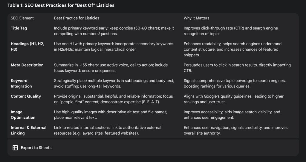
Keyword Integration for Listicles
Listicles, by their very nature, are highly conducive to effective SEO. This format allows for the strategic incorporation of multiple keywords and phrases throughout the content. Each item in a listicle typically has its own subheading, which serves as an ideal location for embedding relevant keywords or phrases. This structured approach signals to search engines that the content thoroughly addresses the topic and its related queries, significantly increasing the likelihood of ranking for a wider array of keyword variations. For an article like this, each website description acts as a mini-section, providing ample opportunity to integrate specific keywords related to web design, UX/UI, and the unique features of each site, thereby broadening the article’s overall keyword footprint and attracting diverse search queries.
Optimal Heading Structure
A well-organized heading structure is crucial for both user readability and search engine comprehension. It is recommended to use a single H1 tag for the main title of the page, which should contain the primary keyword. Subsequent sections and sub-sections should utilize H2, H3, and further heading levels in a logical, consistent, and hierarchical order, without skipping levels. Headings should be descriptive and include relevant keywords where appropriate, enhancing the content’s context and relevance for search engines. This structured approach helps search engines understand the content hierarchy, improves crawlability, and increases the chances of the content appearing in featured snippets or rich results, which are prominent displays in search engine results pages.
Compelling Meta Descriptions
The meta description serves as a concise summary of a page’s content, appearing directly beneath the title in search results. It functions as a critical invitation for users to click on a link. An effective meta description should be approximately 155 characters, use an active voice, include a clear call to action, and incorporate the primary focus keyword. Crucially, it must accurately reflect the content of the page and be unique to avoid duplication issues. An optimized meta description directly influences the click-through rate (CTR), which is a significant factor in SEO performance. By crafting a compelling and informative snippet, the article can effectively persuade users that it offers precisely what they are searching for.
High-Quality, People-First Content
Google consistently prioritizes content that is helpful, reliable, and created primarily for people, rather than solely for search engine manipulation. High-quality content should be original, provide substantial and comprehensive information, offer insightful analysis, and be free of spelling or grammatical errors. Demonstrating expertise, experience, authoritativeness, and trustworthiness (E-E-A-T) is paramount. By providing in-depth analysis of design features and their impact, this report aims to be a valuable resource, naturally aligning with Google’s quality guidelines and fostering trust with its readership. Content that resonates with users and fulfills their informational needs is inherently favored by search algorithms.
Image Optimization
Images significantly enhance engagement and readability, breaking up text and providing visual context. For SEO, it is essential to add high-quality images near relevant text and include descriptive alt text that incorporates relevant keywords. Using descriptive file names for images also contributes to better indexing. Optimized alt text not only improves accessibility for users relying on screen readers but also helps search engines understand the image content, potentially increasing visibility in image search results.
Internal and External Linking
Strategic linking is a powerful SEO practice. Including high-quality internal links to related sections within the article improves user navigation and helps search engines understand the site’s structure and the relationships between different pieces of content. Conversely, external links to authoritative and relevant resources, such as the official award websites or the featured websites themselves, signal credibility to search engines and can boost the article’s authority and trustworthiness. This practice creates a valuable network of information, benefiting both users and search engine ranking.
Conclusion: Designing for Impact and Visibility
The top 25 websites of 2025 collectively paint a clear picture of the future of digital experiences. These pioneers are not merely designing websites; they are crafting immersive, interactive, and highly personalized digital environments that transform pixels into masterpieces. The prevailing trends – from sophisticated 3D web environments and AI-driven personalization to dynamic animations and the embrace of ethical design principles – are shaping a future where online platforms are not just sources of information but deeply engaging and emotionally intelligent spaces. This evolution underscores a commitment to user-centricity, where every design choice aims to create a seamless and memorable interaction.
Ultimately, even the most beautifully designed website needs to be discovered by its intended audience. The analysis consistently demonstrates that the symbiotic relationship between cutting-edge design and robust SEO is non-negotiable for achieving digital success. By prioritizing mobile-first approaches, optimizing for performance, and structuring content thoughtfully for both human users and search engine algorithms, these leading sites achieve unparalleled online presence. Their success is a testament to the fact that technical excellence and strategic visibility are as crucial as creative brilliance.
As the digital landscape continues its rapid evolution, designers and developers must remain agile and proactive. The imperative is to strike a delicate balance between functionality and emotional resonance, ensuring that digital products not only meet user needs but also foster deeper, more meaningful connections with their audiences. The exemplary websites highlighted in this report serve as both profound inspiration and a practical guide for anyone aspiring to create digital experiences that truly stand out and thrive in 2025 and beyond.
Brands are increasingly utilizing their online platforms to create memorable impressions through sophisticated animation, bold color choices, and even integrated short films.