Key takeaways
- Use a bold visual direction to express a relevant brand idea, not simply to look different.
- Keep the reading order, navigation and next step understandable.
- Evaluate loading and responsiveness in the actual implementation; appearance is not a performance measurement.
- Design for readable text, keyboard use, narrow screens and comfortable interactions.
- Test a focused application before changing the entire experience.
A page does not have to be quiet to be clear. Oversized type, visible borders and an unapologetic grid can give a website a strong point of view. The harder question is whether those choices help someone understand the business and use the page.
Brutalist web design is useful to explore when a conventional visual language feels disconnected from the brand. The aim is to find an expression with a reason behind it—and keep that reason visible in the finished experience.
What is brutalist web design?#
In web design, “brutalist” commonly describes an intentionally raw presentation. It can include strong typographic contrast, obvious grid divisions, simple shapes, sharp edges, sparse imagery and controls that make little attempt to hide their structure.
The term is used loosely. One designer may mean a stripped-back page with plain links; another may mean a highly art-directed composition with large type and aggressive color. Those pages can look very different, so a useful brief names the decisions rather than relying on the label alone.
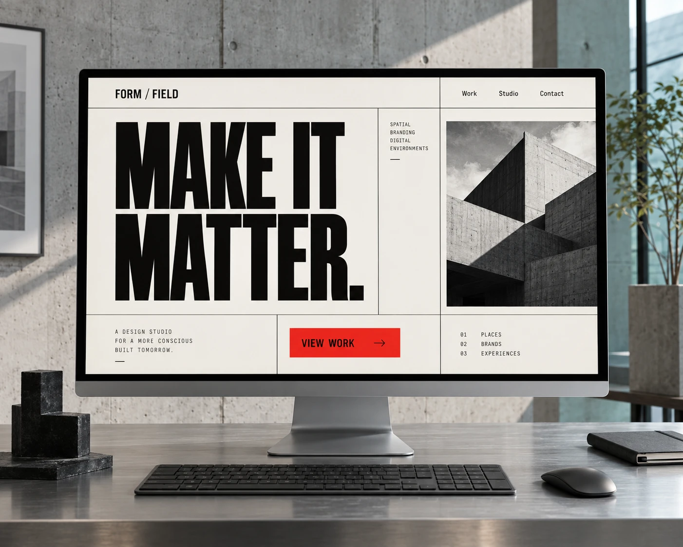
The cover illustrates one interpretation: a fictional studio page using large black type, a visible grid and one red action. It is an original concept, not a screenshot of a client website or evidence of measured performance.
How does brutalism relate to anti-design?#
Both can challenge the familiar look of polished commercial websites. Brutalist treatments often emphasize directness and exposed structure. Anti-design can go further into deliberately awkward arrangements, unexpected scale, visual collisions or conventions used in surprising ways.
That distinction is a working description, not a fixed classification. Instead of debating whether a reference belongs to one category, ask what the treatment does. Does the oversized heading establish priority? Does the unusual navigation communicate something meaningful, or does it simply make the visitor work harder?
Be bold with the expression. Be clear about the task.
When can the approach work well?#
A visually assertive direction can suit a publication, cultural project, creative practice or campaign that has a clear editorial position. It can also bring energy to a product launch or a portfolio whose work benefits from a more direct frame.
The fit depends on the audience and the decision. Someone browsing a design exhibition may welcome exploration. Someone checking a delivery condition or completing an application needs a dependable route to an answer. Different parts of the same website can call for different levels of expression.
Start with brand positioning and a focused brief. “We want to look different” leaves too much unanswered. “We need a confident editorial voice while making the programme easy to browse” gives the design a useful problem to solve.
Which design choices make the direction useful?#
Separate visual intensity from functional complexity. A page can have a strong personality while using familiar reading and interaction patterns.
| Design choice | Useful application | What to avoid |
|---|---|---|
| Oversized typography | Make the central message easy to recognize. | A headline that overwhelms the page or breaks awkwardly on a phone. |
| Visible grid and borders | Group related information and show a clear structure. | Decorative divisions that suggest relationships the content does not have. |
| Strong accent color | Give a meaningful action or detail distinct emphasis. | Competing accents or unreadable text/background combinations. |
| Unconventional composition | Create a distinctive introduction while keeping a logical reading order. | Hidden navigation, disguised controls or a confusing sequence. |
Visual hierarchy still matters. When everything is large, loud or unexpected, the reader has fewer clues about what deserves attention. Choose where the emphasis belongs, then let supporting information do a quieter job.
Does brutalist design improve SEO or loading performance?#
The visual style does not establish either result. A spare-looking page can still load heavy scripts and large assets. A more elaborate page can be carefully optimized. Evaluate the code, media, fonts and third-party services that the visitor actually receives.
Google’s page-experience guidance explains that Core Web Vitals contribute to ranking systems, while good scores alone do not guarantee top rankings. A visual label is not a substitute for relevant content or a usable page.
Check loading, responsiveness and visual stability. The current Core Web Vitals are LCP, INP and CLS; older advice that centers on FID needs updating. Google’s Core Web Vitals documentation describes those measures.
For the page itself, keep meaningful content readable as text, provide descriptive links and a sensible heading structure, and make important routes available without a novel interaction. Our SEO and AEO work builds on those foundations rather than treating an aesthetic as a search shortcut.
What should you check for accessibility and mobile use?#
Strong contrast between shapes does not necessarily mean the text has sufficient contrast. Check the actual foreground and background colors, including labels, body copy and interactive states. W3C’s text contrast guidance provides the criteria and relevant exceptions.
Next, test the page at a narrow width and with larger text. Keep the order understandable as columns stack. Large typography should adapt without cutting off essential words or requiring sideways reading.
- Navigation: familiar labels should help people find the work, the offer and the contact route.
- Keyboard access: links and controls need a visible focus state and a sensible sequence.
- Targets: leave enough room to activate a control comfortably. W3C’s minimum target-size guidance explains the requirement and exceptions.
- Motion: give nonessential animation a clear purpose and respect reduced-motion preferences.
- Information: do not place an essential price, condition or instruction behind a decorative reveal.
These are starting checks, not a complete accessibility audit. The finished implementation needs to be evaluated with its real content and interactions.
How should you test the direction before a full redesign?#
Try a focused page or campaign first. Keep the offer and task clear, then explore how the new visual language affects comprehension and use.
- Define the intended change. For example, make a programme’s editorial character clearer while helping people find an event.
- Build with real content. Test the longest title, ordinary body copy and the practical details—not only a perfect mockup.
- Observe the task. Ask representative readers to explain the offer and locate the next step. Notice hesitation rather than only asking whether they like the appearance.
- Measure the implementation. Review loading, interaction behavior and mobile reading. Use relevant analytics or a properly planned experiment when the question concerns business outcomes.
- Refine the system. Keep the decisions that serve the idea and remove friction that does not. Document reusable patterns before expanding.
A distinctive direction becomes valuable when it helps the brand express itself and gives people a coherent experience. Explore our website-design references for a broader range of approaches, or bring a specific question to a focused experience review.
Frequently asked questions
What is brutalist web design?
It is a broad visual approach associated with raw presentation, assertive typography, visible structure and limited visual polish. The label covers different interpretations; it does not describe one fixed layout or technical implementation.
Is brutalist web design good for SEO?
The aesthetic itself is not an SEO advantage. A page still needs useful content, crawlable information, clear links and a good overall experience. Implementation affects performance, and good performance alone does not guarantee high rankings.
Is brutalism the same as anti-design?
The terms overlap but are not identical. Brutalism often emphasizes exposed structure and directness. Anti-design is a broader challenge to conventional visual rules and may use deliberate disorder or friction. The labels are used inconsistently, so describe the actual choices in the brief.
Can a brutalist website be accessible?
Yes, but accessibility comes from the implementation and testing, not the style label. Readable contrast, logical structure, keyboard access, visible focus, reflow and usable controls are still necessary.
Do we need to apply the style to every page?
No. A campaign or editorial feature can explore a bolder direction while keeping familiar navigation and task flows. Make sure the transition is coherent and that important information remains easy to find.