
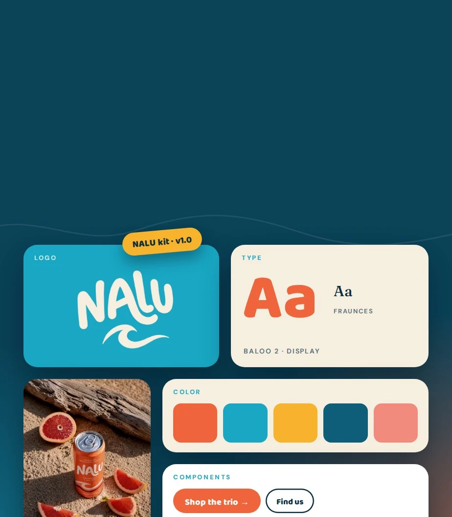
Design System Creation
Create reusable UI components, design tokens and clear guidelines for consistent websites, emails and digital products.
HOUSEINK Studio creates design systems that connect brand foundations, design tokens, reusable components and practical guidance. Build it once, and your team stops reinventing the button: websites, products and campaigns stay consistent as you grow, with clear rules for building, adapting and maintaining them.
THE SYSTEM OPPORTUNITY
Consistency comes from shared decisions.
When every team solves the same problem differently, the experience starts to drift. A practical system brings those decisions together and gives people room to create without losing what makes the brand recognizable.
WHAT WE CREATE
From visual foundations to the patterns teams use every day, the system is shaped around real applications.
Create reusable UI components, design tokens and clear guidelines for consistent websites, emails and digital products.
Assess UI components, accessibility and documentation to identify inconsistencies, reduce duplication and prioritize improvements.
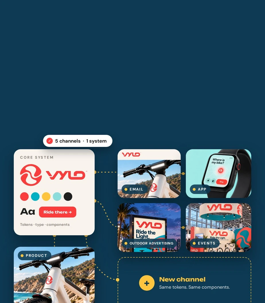
Add components and patterns for new products and channels, with shared standards that keep your growing brand consistent.
Build reusable email modules and responsive templates that speed up campaign production and keep every message on brand.
Refine component behavior, responsive layouts and accessibility, with practical documentation for easier design and development.
A SHARED LANGUAGE IN PRACTICE
The foundations become components. Components become patterns. Clear guidance helps the whole system work across people and projects.
48162432
Decide once. Type, color, spacing and shape become named, reusable tokens.
Build with the decisions. Components inherit the tokens, so every piece already fits.
 7:52
Ride the light.
Use it everywhere. New pages and campaigns come together faster and stay consistent.
Illustrative system study for VYLO · foundations → components → application
BUILT TO BE USED
A system becomes valuable when people know how to use it. We connect the design work to practical examples, clear ownership and a considered path for change.
Explore Web DesignExplain when a pattern fits, how it behaves and where teams can adapt it.
Define who maintains the system and how new needs are reviewed.
A clear way to add or improve components as the brand and product grow.
FROM AUDIT TO ADOPTION
We start with what you already have, then build only what the team will really use.
Review existing assets, recurring patterns and the needs of the team.
Color, type, spacing and structure agreed before components are built.
Create the agreed components and test them against real use cases.
Document the decisions and agree how the system is used and maintained.
CONNECTED SERVICES
LET’S MAKE YOUR NEXT MOVE
A new design system, an existing library to improve or more channels to bring together. Tell us where your team gets stuck—we’ll define the foundations, components and guidance that help the work move forward.
Start a Conversation
Connect strategy, identity, tools and ownership so the brand works across teams and channels.

A practical guide to typography, contrast and layouts that make the next step clearer.

The updated 2025 edition: practical lessons in brand, commerce, interaction and usability.
DESIGN SYSTEM ANSWERS
A design system brings together shared visual foundations, reusable components and guidance for creating consistent work. It gives designers, developers and content teams a common reference for decisions that would otherwise be repeated across projects.
Brand guidelines define how the identity should look and sound. A design system extends those principles into reusable components, patterns and working rules. The scope can include digital interfaces, content templates and guidance for implementation.
Yes. We can review the identity, design files and existing experiences before deciding what to keep, improve or consolidate. The goal is a practical system that reflects the brand and the work your team actually needs to create.
A coded library can be included when it is part of the agreed scope. We clarify the technology, component requirements and collaboration with your development team before work begins. Design libraries and implementation deliverables are defined separately.
Adoption can be supported through documentation, examples, handoff sessions and agreed ownership. We focus on the recurring tasks the team needs to complete and provide guidance that makes the system useful in everyday work.
A system needs a clear owner and a process for reviewing changes. We can help define contribution, approval and maintenance practices, with ongoing support scoped around the needs and capacity of your team.